Travel Triangle and WeAreHolidays are two startups that have recently caught everyone’s attention in the online travel marketplace segment in a very big way. While Noida based Travel Triangle raised $8 million funding led by Bessemer Venture Partners last month, Gurgaon based WeAreHolidays had raised Series A founding round in the range of $3-$6 million last year.
Both platforms are helping Indian travellers to plan their trips by providing them tailored tour packages for destinations of their choice from listed travel agents. So if you want a custom package from Delhi to Mauritius and want to find competitive quotes from a bunch of travel agents, these are just the services that would assist you.
Let’s look at how these two travel-planning services stack up against each other and who the real winner is?
Comparison 1: The Device Test
From the looks of it, the websites for both of these platforms have been designed and built for the desktop world. Though the websites are fully responsive keeping in mind the needs of the mobile traveller, we didn’t find links to their apps on the mobile version (None of the websites pointed us to Android/iOS apps).
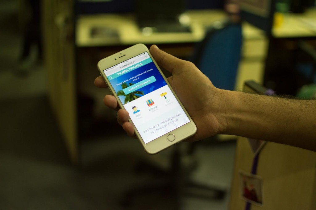
The Travel Triangle website looks good on mobile but we have been served with wrong version at times
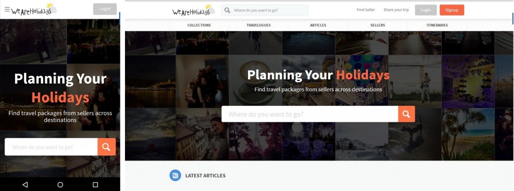
On the mobile platform, WeAreHolidays ranks a little better in terms of overall look-and-feel. Its appearance is the same on both desktop & mobile device, providing a smoother transition for the user.
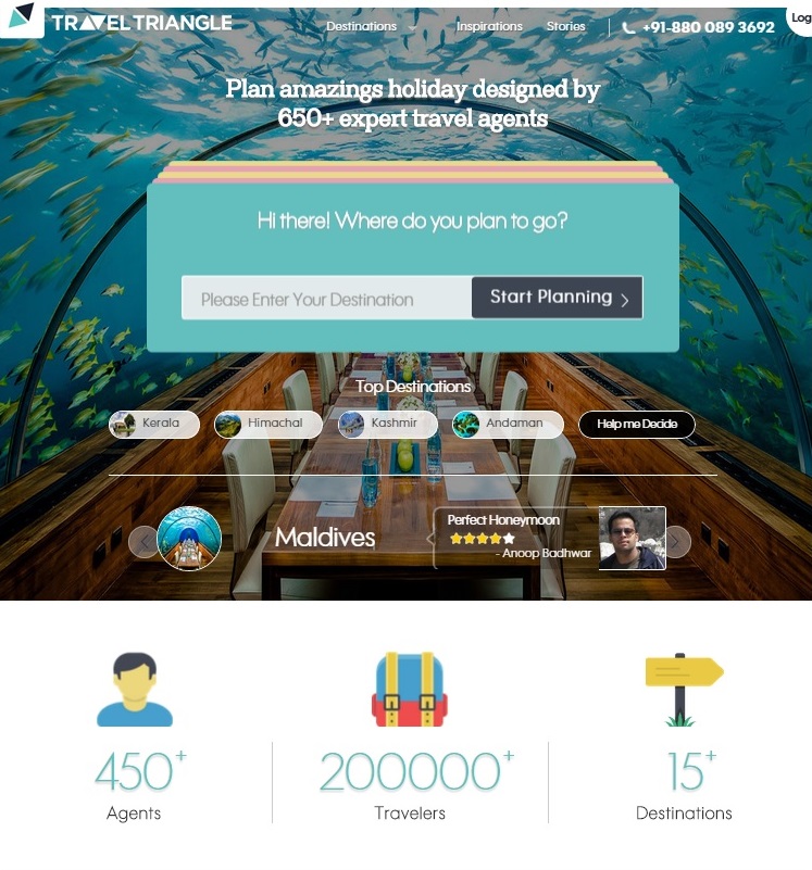
On the other hand, it does appear that the technology team at Travel Triangle has put in specific thought towards rendering of their website on the mobile device. On loading, you can see two different versions for both Desktop & Mobile.
Earlier there was some discrepancy in the content on both devices. While the desktop version claimed that Travel Triangle has 650+ expert travel agents on board (scroll down and it was 450+), the mobile site claimed to have 450+ expert agents. In addition, the text formatting on the mobile device could have been a little cleaner.
Later when we tried visiting the website on another desktop computer, we were greeted by a different website which was similar to the mobile version. What added to the surprise was the fact that at times, even the mobile website looked different on different devices. Not sure if they are serving different versions to different devices and browsers or it is some technical glitch on their end.
Winner Verdict (Device Test): WeAreHolidays
Comparison 2: Traffic Comparison
So who garners the traffic juice among the two?
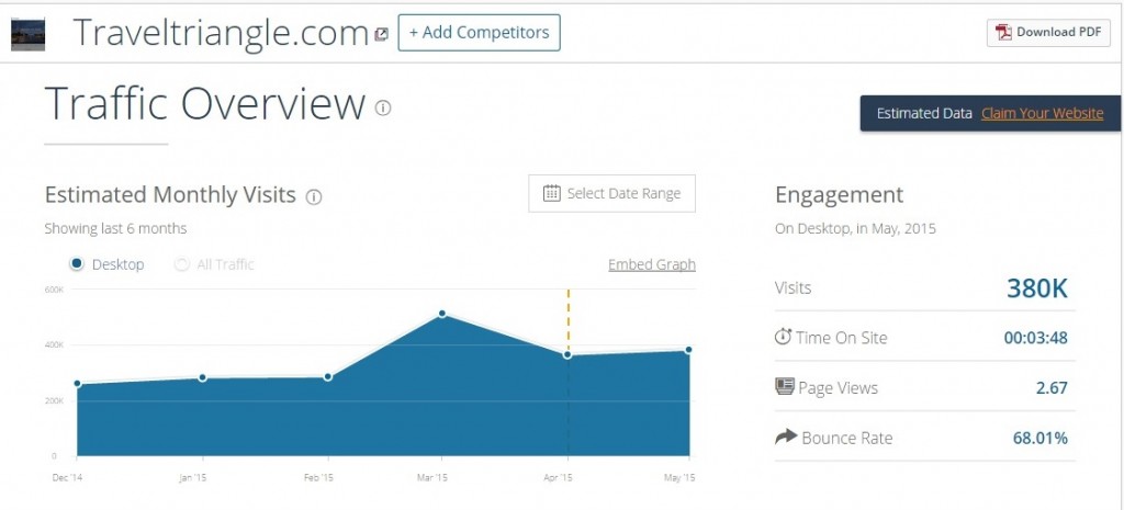
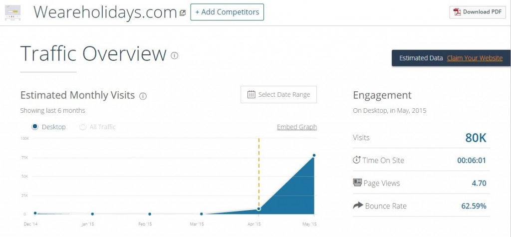
We have used similarweb.com to find the estimated monthly traffic for the two websites. No points in guessing, who wins the round of traffic!
With estimated monthly visits pegged at 380k, Travel Triangle does beat WeAreHolidays by quite a handsome margin that has 20k estimated visits for the ‘.co.in’ and 80k for ‘.com’. When combined, the total traffic comes at 100k i.e. about 26% of the total traffic of Travel Triangle.
Winner Verdict (Traffic): Travel Triangle
Comparison 3: UI & Design
The websites that really inspire smart travellers these days are the ones that are device agnostic and provide an intuitive interaction experience. On this front, the overall design of both is very smooth and we must admit that there is very little to choose between the two.
Travel Triangle
On the homepage, Travel Triangle presents you with the option of selecting a destination and lists down some popular destinations if you scroll down. The page looks neat and we loved the character illustrations used by Travel Triangle instead of real people. They have also used simple icons to highlight some of the key site features.
WeAreHolidays
WeAreHolidays presents you with the destination search option like Travel Triangle when you visit the website but scroll down and you will find a lot more than just tour packages. You will find articles about travel, travelogues, featured sellers and recently booked itineraries among other items. This might make the home look a bit cluttered but could motivate people to browse around among articles and travelogues.
Winner Verdict (UI & Design): Tie, Travel Triangle has got a neat design but WeAreHolidays manages to earn more page views per visitor with its design.
Comparison 4: Depth of Content
The common problem with most of the recent startups is the lack of adequate content to provide user stickiness and decrease bounce rate. So let’s find out whether these two portals have the content to keep you hooked.
Travel Triangle
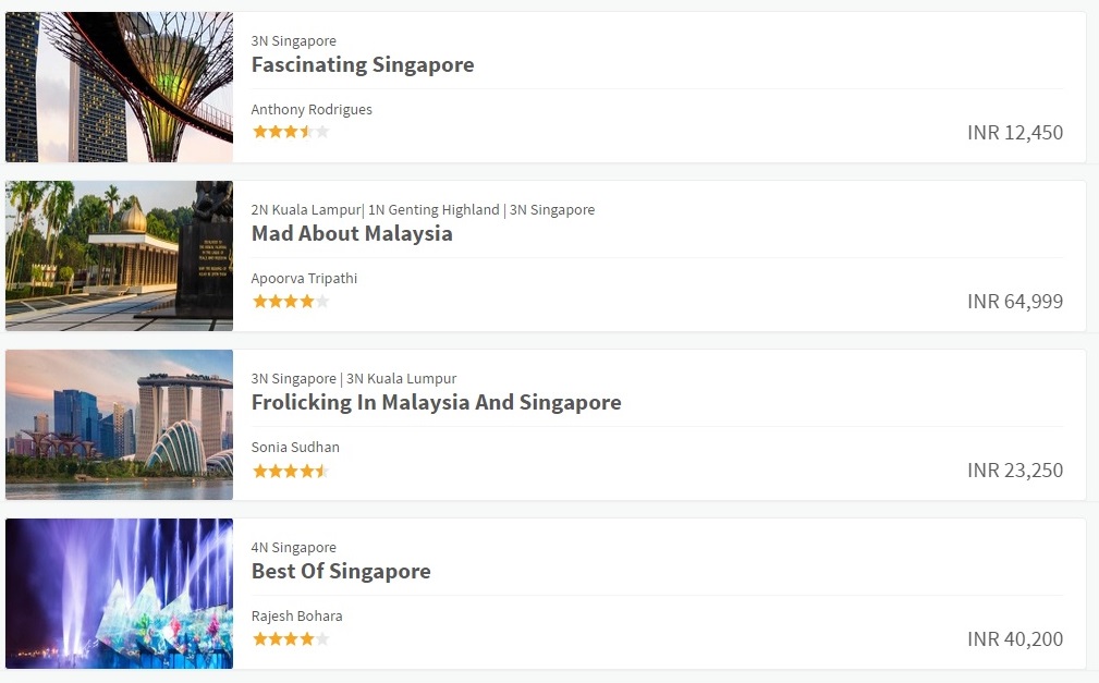
We did a quick search for 3-day tour packages to Singapore in the budget range of 43,000 – 76,000 INR. To our surprise, we didn’t find any tour package in the search results. We tweaked the filters a little bit and increased our budget range and number of days, but the result was still the same. Even if there are no packages to show for the selected filters, they can at least show some other packages along with the message keeping one of the filters like price or days flexible.
(Update- On browsing through Travel Triangle again after a gap of few days, we found that they have changed this and now serve you the option of browsing packages in different budget or different duration in case your search doesn’t yield any results.)
They have a blog which is updated regularly and features some interesting posts but it is not very visible on the website. Making the blog more visible could help them keep the users engaged and use the posts for creating the urge to travel.
WeAreHolidays
WeAreHolidays seems to be slightly better when it comes to engaging content. The searches are simple and the search results contain a lot more than just travel itineraries. Of course, the travel itineraries are a top priority because that is what they are selling so they sit on the top in the results but along with that you will find various travelogues and articles. This helps in engaging the visitors and motivate them to spend more time on the website. The frequency of posting isn’t as high as Travel Triangle, but presentation earns them some points here.
Winner Verdict (Depth of Content): WeAreHolidays
Comparison 5: Navigation & Experience
Now that Travel Triangle didn’t like the idea of a trip to Singapore, we decided to browse our options for Kerala on both the websites.
Travel Triangle
Travel Triangle used to ask multiple questions (around 5-6) before you see any itineraries (and like it happened in case of Singapore, there are chances that you won’t see any results at the end of it). Now however they have made some changes. They will still ask you questions, but not many and they are all presented on the homepage itself. This considerably improves the navigation experience. There are multiple filters so that the visitor can easily kill the options that are irrelevant to him/her.
WeAreHolidays
WeAreHolidays has got a simple search box where you enter the destination and see results that include itineraries, travelogues and articles. Now the articles and travelogues are all good but their primary objective of getting traffic is to get bookings and they have left some gaps here. There are no filters to be seen here for narrowing down among the presented options (or they are not visible enough) and it is hard to spot the desired ones in a sea of options. It isn’t exactly very clear what factor they are using to decide the order of listings either. From what we can see, it isn’t according to the price, duration, cost, cost per day or ratings. The least they can do is add the option to sort the results.
Winner verdict (Navigation & Experience): TravelTriangle
Overall Verdict
Travel Triangle gets more traffic, but WeAreHolidays manages to retain the visitors for longer, Travel Triangle has got a neat UI while WeAreHolidays offers more content. The point is that both the websites are good at something or the other, but neither one of them takes the cake. Both the websites need to iron out some major issues before we recommend one of them wholeheartedly. Until then, we think WeAreHolidays will do a better job of providing you with travel inspiration and finding you a travel agent.


