Using a product involves making decisions. And when we give users a choice, we often have a vested interest in them choosing one option over another. Because we know it’ll make their experience less complex. Because we know they’ll save time that way. Or even because it’ll improve the experience for other users.
When we confront users with these decisions, asking them a simple yes/no question will help them choose the best option.
Let me tell you how I found this out…
At BlaBlaCar, our product is a peer-to-peer ridesharing platform. We connect people who need a ride somewhere with car owners going the same way. Car owners offer a ride, co-travellers book a seat with them. Pretty simple concept.
But when car owners offer a ride, there’s a divergence in the way they might want their experience to go. Do they want co-travellers’ bookings to be approved automatically? Or do they want to choose which co-travellers they travel with, by approving or declining each booking themselves?
A seamless experience
We want our members’ travel experience to be seamless. They need to have as few interactions with our product as possible, and little to no waiting time.
So for both car owners and co-travellers, the most seamless experience is clearly to have bookings approved automatically. But in some of our markets just 1 in 4 car owners were choosing this option.
You might think, why not just remove the option to approve or decline bookings, and force “automatic approval” on everyone? But remember, our product connects people who’ve never met so they can share rides together. It’s a new concept for many people, and one we need to make them feel comfortable about. Allowing new car owners the option to choose exactly who they take in their car is a way to break down that first barrier, so there was never any question of removing it entirely.
However, we know that once a car owner has shared their car a few times and has become comfortable with the idea, automatically approving bookings will greatly smoothen their experience. So we wanted to increase the number of car owners choosing this option.
But before we could find a solution, we had to identify the cause of the problem. Why were more of our experienced car owners not choosing to automatically approve bookings?
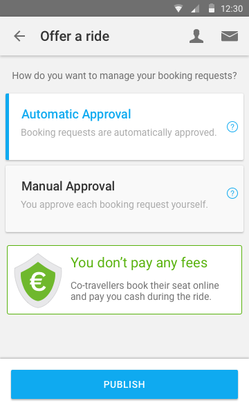
This is the original screen-Manage booking requests? Automatic Approval? Manual Approval? What does this all mean!!
One of our hypotheses was that car owners just didn’t understand the benefits of approving automatically — this was based on two assumptions. Firstly, that they were scanning rapidly over the screen (as the majority of us do with any online product) and the content wasn’t obvious enough for them to see the advantages of choosing that option. Secondly, that they didn’t understand the question, or the answers. “Automatic Approval” and “Manual Approval” are terms we invented, terms specific to the BlaBlaCar product, and not at all intuitive.
So, we changed the question, and we changed the answers. The hypothesis was that car owners weren’t fully understanding the options in front of them, so we went for simple. Really, really simple.
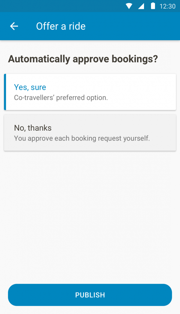
This is the new screen. Now we ask car owners a simple yes/no question. And they get it.
Yes or no?
How many times a day do you ask yes/no questions? Do you want a cup of tea? Yes or no? Do I really need to come to your 3-hour strategy meeting? Yes or no? Will you proofread my Medium article? Yes or no?
We do it a lot, and we do it because it’s very precise. A yes/no question leaves very little room for misinterpretation or for a vague answer. So that’s why we decided to ask our car owners, “Automatically approve bookings? Yes or no?”
Of course this design was purely based on a hypothesis, so we AB tested it. And the results quickly gave us the proof we needed — as many as 37% more car owners were choosing to automatically approve bookings.
A better-informed decision for a better experience
This improvement happened because we asked a simple question. The simplest question. The content changes were of course accompanied by visual design changes, but the goal was the same, to simplify the screen and get the user focused on the question being asked.
Simple content always helps users use your product in the right way. And when there are two ways of using your product, simplicity can also help them make a better-informed decision, for a better experience.
Author
Paul Stairmand is Content Specialist at BlaBlaCar, the peer-to-peer ridesharing platform. He’s a designer… of words. He crafts the words for the BlaBlaCar website and mobile apps, creating the content that makes the UX design work. He believes that good content makes users understand things without knowing there was anything to understand.
This post first appeared on Medium and has been republished with author’s permission.


